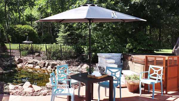


Opt for a combination of muted tones like beige and terracotta to create a calming atmosphere while maintaining style. Pairing these hues not only complements outdoor settings but also provides a soothing backdrop for relaxation. This article explores various palettes that enhance aesthetic appeal and practicality.
Homeowners, event planners, and outdoor enthusiasts will find this guide particularly useful. By understanding how different shades interact with the environment and their psychological effects, you can make informed choices that elevate your outdoor experience.
In this article, you’ll discover a range of appealing palettes, from classic pairings to bold contrasts. Each suggestion includes practical insights on how to harmonize your canopy with other outdoor elements, ensuring a cohesive look for your space. Whether you’re hosting a garden party or simply enjoying a family gathering, the right color scheme can make all the difference.
Best Colour Scheme for Patio Canopies
Choosing shades for a patio canopy requires careful thought about aesthetics and functionality. Light colors such as white or cream can reflect sunlight, keeping your space cooler, while darker hues like navy or charcoal can add a sophisticated touch.
Combining complementary shades enhances visual appeal. Pairing a soft blue with a warm beige creates a serene atmosphere, while a bold red with a muted grey offers a striking contrast. Patterns can also enhance your design, such as stripes or floral motifs that incorporate multiple tones.
Considerations for Selection
- Heat Reflection: Light shades are ideal for minimizing heat absorption.
- Durability: Colorfast materials ensure longevity even under harsh sunlight.
- Style Harmony: Match with furniture and surroundings for a cohesive look.
Experimenting with combinations can lead to unique outcomes. A soft pastel palette creates a calming environment, while vibrant colors can energize the space. Consider testing samples in natural light to see how they interact throughout the day.
| Shade | Effect |
|---|---|
| White | Reflective and bright |
| Beige | Warm and inviting |
| Navy | Elegant and bold |
| Pastel Blue | Calming and soft |
Understanding Colour Psychology for Outdoor Spaces
The selection of shades for outdoor canopies significantly influences the ambiance and functionality of a space. Warm tones like reds and oranges evoke feelings of energy and warmth, making them ideal for lively gatherings. In contrast, cooler hues such as blues and greens can create a tranquil environment, perfect for relaxation and unwinding.
Incorporating neutral tones can serve as a versatile backdrop, allowing bright accents to stand out without overwhelming the senses. These subtle shades are particularly effective in enhancing the natural surroundings, blending seamlessly with the outdoor environment.
Psychological Effects of Various Hues
Each tone carries unique psychological implications that can transform an outdoor setting:
- Red: Stimulates excitement and passion, often associated with warmth and energy.
- Yellow: Represents cheerfulness and optimism, ideal for brightening up a space.
- Blue: Conveys calmness and serenity, promoting relaxation and peace.
- Green: Symbolizes nature and tranquility, fostering a sense of renewal.
- Purple: Suggests luxury and creativity, adding a touch of sophistication.
- Black: Offers elegance and modernity but can absorb heat in sunny areas.
When selecting shades for outdoor coverings, it’s beneficial to consider the intended use of the space. For example, vibrant tones may enhance social interactions in entertainment areas, while muted shades might be more suitable for quiet retreats.
In conclusion, understanding the psychological impact of different shades can help create a harmonious outdoor environment that aligns with personal preferences and desired experiences. Choosing the right palette not only enhances aesthetic appeal but also influences mood and atmosphere, making it a key aspect of outdoor design.
Trending Color Palettes for Outdoor Canopies
Choosing the right shades for outdoor canopies can greatly enhance the aesthetic of patios, gardens, or pool areas. Earthy tones such as terracotta, olive green, and sandy beige are gaining popularity, offering a natural and warm ambiance.
Another notable trend includes the use of cool tones. Soft blues, muted grays, and seafoam green create a calming atmosphere, perfect for relaxing spaces. These colors not only provide shade but also blend harmoniously with outdoor surroundings.
Popular Combinations to Consider
- Terracotta and Cream: This pairing adds warmth and a classic touch.
- Olive Green and Soft Yellow: A fresh and inviting look that brightens any outdoor setting.
- Muted Gray and Dusty Blue: A sophisticated duo that complements modern architectural styles.
- Seafoam Green and Coral: A playful yet elegant combination that evokes a beachy vibe.
Incorporating patterns can also elevate the design. Stripes or geometric shapes in complementary hues can add visual interest without overwhelming the space. Consider alternating colors in your design to achieve a balanced look.
Ultimately, selecting shades that resonate with your personal style and complement the surrounding environment will create a cohesive and inviting outdoor area.
Practical Tips for Choosing UV-Resistant Fabric Colours
Opting for darker shades can significantly enhance protection against harmful rays. Darker hues absorb more UV radiation, preventing it from penetrating the material. However, consider that these tones may retain heat, potentially making shaded areas warmer.
Choosing lighter shades aids in reflecting sunlight, keeping the covered area cooler. Whites, creams, and pastels are effective at minimizing heat absorption while still offering some level of UV protection. However, these tones may fade more quickly when exposed to intense sunlight.
Factors to Take into Account
- Fabric Type: Different materials have varying resistance levels. Look for textiles specifically designed to block UV rays.
- Durability: Ensure the fabric can withstand prolonged exposure without degradation or fading.
- Maintenance: Some shades may require more care to keep them looking fresh and clean.
Testing the fabric’s UV resistance can provide valuable insights. Many manufacturers conduct tests that measure the UPF (Ultraviolet Protection Factor) rating, which indicates the level of UV protection a material offers. Aim for fabrics with a UPF rating of 30 or higher.
Lastly, consider environmental factors such as your local climate and the intended usage duration. Areas with high sun exposure may benefit from darker options, while those in milder climates can opt for lighter shades without sacrificing protection.
Final Thoughts on Pattern and Solid Pairings for Stylish Canopy Designs
Choosing the right mix of designs and plain hues enhances the aesthetic appeal of outdoor canopies. Consider using bold patterns alongside muted tones to create a striking visual effect while maintaining balance.
When selecting patterns, opt for geometric shapes or floral designs that resonate with your outdoor space. Complement these with solid colors that reflect the natural surroundings, ensuring a cohesive look.
Recommendations for Pairing
- Floral Patterns: Pair with soft pastels like blush pink or mint green.
- Stripes: Use neutral colors like beige or gray for a classic touch.
- Polka Dots: Combine with a solid navy or forest green for a playful yet sophisticated vibe.
- Geometric Prints: Match with monochromatic shades like black or white to enhance the design.
By thoughtfully blending designs and solids, you can create an inviting atmosphere that elevates your outdoor experience.
Best colour combination for sun umbrella
Features
| Color | Beige |
| Size | 9FT |
Features
| Part Number | 4336583223 |
| Model | 4336583223 |
| Color | TAN |
| Size | 9 FT |
Features
| Color | BROWN |
| Size | 6ft x 50ft |
Video:
FAQ:
What are some popular color combinations for sun umbrellas?
Popular color combinations for sun umbrellas include classic pairings like navy blue and white, which evoke a nautical theme, and bold choices like red and yellow, which create an eye-catching contrast. Earthy tones such as olive green and beige can provide a more subdued and natural look, perfect for gardens or patios. Additionally, pastel shades like mint green and soft pink offer a light and refreshing aesthetic, ideal for summer settings. Ultimately, the best combination depends on personal taste and the surrounding decor.
How do color combinations affect the temperature and UV protection of a sun umbrella?
The color of a sun umbrella can significantly influence its performance. Darker colors, such as black or deep blue, absorb more heat, which can make the area underneath feel warmer. Conversely, lighter colors, such as white or light gray, reflect sunlight and can help keep the space cooler. Additionally, darker shades may provide better UV protection because they can absorb more harmful rays. When selecting a color, consider both the aesthetic appeal and how the color will perform under the sun’s rays.
Are there any tips for choosing a color combination that complements outdoor furniture?
To choose a color combination for a sun umbrella that complements your outdoor furniture, start by examining the existing color palette of your space. If your furniture features bold colors, opt for a more neutral umbrella to balance the look. For a cohesive design, select matching or complementary shades from your furniture. For example, if you have a brown wicker set, an umbrella in earthy tones or a soft cream can enhance the overall appearance. Additionally, consider the style of your furniture; modern pieces may pair well with bold, bright colors, while traditional styles may look best with classic combinations.


